Renovation in an office can take place according to two scenarios: traditional, when white, light beige or light gray tones are chosen for wall decoration, and also non-standard, when you want to create an interesting design precisely by finishing the walls. In the latter case, repairs usually involve the development of a design project and the involvement of specialist designers.
Choosing an unconventional path for finishing does not always lead to an increase in the cost of the project. Moreover, the cost of design and design pays off much faster than the cost of simply painting the walls the same color as it was. Creating an original office design, including through interesting wall decoration
- increases the productivity of office employees,
- provides them with comfort in the workplace,
- increases the attractiveness of the office and the services offered to clients,
- forms a positive opinion about the company.
It’s safe to say that the efficiency of its work and profit in the short term depend on how much it costs to renovate an office.
Principles of color selection
The color of the walls is selected depending on
- room area,
- location of windows relative to cardinal directions,
- the size of the windows and the degree of illumination of the room.
In some cases, the lack of natural light can be corrected by adding additional light sources. Traditionally, warm shades are used to decorate walls and rooms with north-facing windows, while cool tones will help cool the interior of south-facing rooms.
In addition, the choice of wall color is influenced by
- choosing an interior design style,
- wishes of the management, owners and employees of the office,
- the color of the furniture, if it is not intended to be replaced,
- the color of other finishing materials, if they have already been selected and purchased, as well as
- principles of the influence of color on the human psyche.
- an excess of bright colors distracts, overloads the nervous system, excites,
- variegation can cause headaches and increase fatigue,
- calm warm tones can improve performance,
- cold shades visually expand the space, give it volume, and also promote concentration,
- the combination of cold and warm shades allows you to achieve the psychological background necessary for effective work,
- green color has a positive effect on vision, gives rest to the eyes during hard work on the computer, promotes concentration, but this does not mean that the office should be completely decorated in green tones; the presence of details and spots of this color is quite enough,
- gray calms and calms,
- pale yellow increases mental activity,
- purple and blue can suppress emotions and even cause depression; in the office, purple has a negative effect on mental activity, and blue reduces productivity and puts you in a dreamy mood,
- pink shades also reduce productivity and are not recommended for decorating office space.
Psychologists believe that the choice of colors in office design and in particular for wall decoration affects performance, composure and concentration, brain activity, the state of the nervous system and fatigue. Many years of practice have proven the validity of their conclusions.
So, psychologists believe that
To decorate walls in offices where employees are engaged in creative work, it is recommended to be more creative, use more color combinations and smooth transitions. Premises in which strict calculations are carried out or sales are carried out should be decorated in a more strict style so that nothing distracts employees and clients from the main task.
Based on research conducted by scientists, it has been established that the environment in the office affects labor productivity, the desire to come to work and stay in the office the whole working day. Therefore, the choice of colors should be approached wisely, taking into account the psychological state of workers when perceiving a particular color. What color to choose for the walls in the office?
When choosing a design for an office, you should take into account many factors and the influence of colors on a person’s visual perception. To create an overall picture, you can give the following examples of wall painting:
- Gray and its derivatives or neutral colors. Refers to calm tones. They do not irritate the eyes, but cause despondency and apathy. The gray shade of the walls in the office matches the color of the employees' clothes, so it is possible that soon everyone will fall asleep at work, and as a result, labor productivity will decrease.
- Painting the office yellow. The opinion of psychologists is twofold. Some believe that this color of the office pleases the eye, lifts the mood and increases productivity. Experts have a different opinion that in such an environment it will simply be impossible to concentrate on the task at hand. Both are scientifically substantiated and have their own evidence, but for each person, the attitude towards this color is individual and everything will depend on his perception.
- Green. For the office, this tone is the most optimal. It does not tire you out during the working day, and therefore you can work quietly for a long time. Decorating walls with green color is soothing to the eye. When doing work that requires concentration, this is the most suitable solution. The design of the selected covering in green tones gives it a business-like appearance at the same time.
- Blue. If you paint the walls of office premises with this color, the productivity of employees will also be at a high level. If your work activity involves calculations or small details, then this solution will be optimal. It is important to choose the color blue, not blue, otherwise the perception will be the opposite.
- Brown. When choosing such a design, you should take into account that it has a depressing effect on the human psyche. But if you paint the walls, for example, in an investigator’s office, it creates a feeling of security for visitors.
- Red. Only creatively minded workers can choose such tones. A room painted in similar tones enhances emotionality and causes aggressiveness in mentally unbalanced people. Red is invigorating and good for people whose work activity is aimed at performing physical labor. This color is strictly not recommended for use in the office of a manager involved in negotiations and concluding contracts. Such a design will only aggravate situations that arise when resolving controversial issues, causing excitement, irritation and, perhaps, conflict situations.
- Orange. Applying this tone to the walls will be ideal for receiving clients and concluding contracts. But it is recommended to use an orange tint; it is softer and does not irritate the eyes.
- Violet. It calms and helps you relax, so certain places can be painted in these tones.
- White. Painting the walls in an office in this color will make even a small room visually larger; white also gives a business-like and austere look.
- Black color in the office is used to create contrast with other tones. In general, black will only cause negative reactions from others.
Blue color in the interior
Blue is a cool shade but has calming properties. According to psychologists, this is due to the association with sea water and sky. Because of this, there can be an interesting effect - if you paint the ceiling blue, the ceiling will visually become higher. This is probably all due to the same association. A color that will encourage you to take a little break from your problems, to dream and engage in introspection. The blue tint negatively affects appetite, so it should not be used in dining rooms and kitchens. But for a living room or children's room it will be just right. It is believed that the color blue can have a positive effect on people suffering from insomnia and deafness.
Blue goes well with blue, violet, green, gray, yellow.
What rooms is it suitable for? The blue color looks great in the living room, nursery, bedroom, and will also be good in office meeting rooms.
Example palette: RAL 670-1, Benjamin Moor Old Pickup Blue 2054-60
How to choose the right shades
The chosen design depends on several parameters, and in order to correctly determine what exactly is suitable, you do not have to be a specialist. The following factors should be considered:
- room area parameters;
- Which sides are the windows facing?
- room illumination;
- window opening sizes.
- If additional lighting is needed, this problem can be solved by adding lamps on tables or walls.
- Decorative paints of warm shades are used for rooms whose windows are directed to the north side, and, on the contrary, cool tones are used for the south sides.
The color of the walls in the office also depends on the furniture intended for purchase or available in the room.
- interior style;
- personal wishes of employees or managers;
- furniture color schemes;
- colors of other finishing materials, if available;
- impact on mental state.
On video: paints for the office and living room.
Wall color according to Feng Shui
Feng Shui is designed to make the environment around a person favorable, using objects and color combinations. Those who adhere to this direction believe that all the colors that surround a person at home carry a certain energy and thereby influence his spiritual state. When decorating a room, they start from the direction of the world in which the room is directed and on this basis they choose a palette for masculine or feminine principles.
Related links: Interior design for a small kitchen
Psychologists' opinion
As noted above, the color of the walls in the office has a direct impact on a person’s mental state, his performance, including the ability to concentrate on tasks and, in general, his productivity during the working day. In practice, many factors have been confirmed.
List of expert opinions:
- The design, rich in bright colors, is aimed at stimulating the nervous system.
- Decorative paint of different colors and shades can trigger migraines and increase fatigue.
- Calm tones are good; they increase performance.
- It is recommended to choose cool colors for small areas; they visually expand the space and provide focus on a particular task.
- The best results are achieved by combining warm and cold shades, and the effect on the human psyche will be positive.
- The green color is always pleasing to the eye; this solution ensures the concentration of employees’ attention, especially if their activities involve working on a computer.
- The design in gray tones is calming, but also allows you to fall asleep at work.
- Yellow color is used to increase mental activity.
- Decisions on choosing purple or blue colors will not be entirely successful; they suppress performance.
- Pink colors also have a negative impact on labor productivity.
The manager or his subordinates decide what color to paint the office. But if the work being done is related to creativity, then bright and rich colors should be used. For work that requires concentration, calmer shades are suitable.
Green color in the interior
Green color is associated with wildlife, grass, and plants. It symbolizes youth, hope, freshness. A green interior is a great place to meditate; it has a calming effect on perception and helps you relax. At the same time, green color helps to concentrate on tasks and it definitely won’t be out of place in your office. Just as in the case of yellow, green is good to use as an accent color - furniture elements, a painted partition, a carpet with imitation grass, curtains. It is important to feel in moderation and not get carried away.
Green goes very well with brown, black, and white. A good combination can be green with red, blue and beige.
What rooms is it suitable for? Green will fit perfectly into the interior of the living room, bedroom, and office. Light herbaceous shades will look good in the bathroom and kitchen.
Example palette: RAL 6018, Benjamin Moor Feel the Energy 417
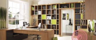
Office decoration
What color should I use when decorating my office? Such a decision depends on the opinions of employees, including their type of activity. But it should be borne in mind that the choice of light shades is most optimal for employees. This gives both efficiency and efficiency.
The main goal is compliance with labor safety standards, including maintaining health during work. Every manager should know this, since he is the one responsible for the health of his subordinates.
If it is difficult to determine on your own what colors to choose for decorating your workspace, especially if the work has different directions, then it is recommended to turn to professionals. Specially trained people who have supporting documents for this type of activity will be able to correctly assess the situation and find a suitable solution.
Beautiful color combinations (2 videos)
The psychological climate in the team and, ultimately, the success of the business directly depend on the color scheme of the office interior.
The design solution for each specific office is individual, but there are certain rules, proven by many years of operational practice, that should be followed. For example, when choosing a color scheme for cabinets, you need to be guided not so much by personal preferences as by color psychology.
The choice of color for the office also depends on what conditions the work requires: concentration or stimulation and revitalization. The choice of color in the office interior is in many ways the choice of the working atmosphere in the team. It is known that cool neutral colors create a businesslike mood and help to concentrate, while warm, rich tones encourage communication and promote a friendly climate - they are ideal for meeting rooms and showrooms. Psychologists say that due to short presence, fatigue will not be felt. But at the same time, we must not forget about the preservation of a single style solution for the office. As a rule, you should choose colors that are close to natural or neutral.
The best option is when the walls, ceiling, and floors are kept in light colors, and bright color accents are transferred to work chairs, sofas and chairs. Office chairs can have rich colors that are rarely used in upholstered furniture for residential buildings. Options are not excluded when a neutral palette can be contrasted with a modern solution: paint the room in a deep, rich color, which can be dominant, and additional colors can be subordinate to it. Such a color scheme requires a certain tact and accuracy, since saturated deep tones have the property of being “annoying.”
Thus, muted yellow color has a positive effect on mental activity, moderately tones and helps intellectual work. Blue color calms and thereby helps to find the right solution, while green, on the contrary, promotes concentration and has a positive effect on vision. Pearl gray is ideal for creating a calm work environment. Until recently, blue remained the main color choice for office spaces. Sky blue, royal blue and navy blue are the most sought after colors in interior design. Designers, as a rule, advise choosing one of these colors as the main paint for office walls.
Red color is a strong irritant, and rich blue or purple colors act in exactly the opposite way: emotions, both positive and negative, are suppressed. The same applies to black - even black furniture will have a depressing effect, not to mention walls, ceilings or mobile partitions.
In the work area, the color of walls and carpets, as a rule, should be in harmony with the colors of office furniture; pastel colors are usually used.
Preferably gray, blue and green colors. They are practical and functional. But bright color accents won't hurt. Whether it is a flower or a poster does not matter much. Something else is important. Pictures with a dynamic plot, for example, are capable in some way of programming people to be active in their work. And vice versa, in a department where everything is boiling and seething, calm landscapes are often hung on the walls - they can give employees some relaxation. Sometimes designers simply install something bright, such as a sofa, next to “dull” workspaces. It also provides an opportunity for emotional release.
Pure white and black colors, which are considered especially elegant in clothing, are undesirable in the interior. Although sometimes they are used by companies, often for the purpose of saving. Designers even have such a concept as a “black and white office” - this is what they call a “cheap” office, where both the decoration and furniture are of low class.
However, the color scheme of your office depends not only on the psychology of a person’s perception of a particular color. What exactly the company does is also important. Thus, psychologists have long proven: the higher the employee’s intelligence, the more complex, sophisticated shades he prefers. Therefore, when thinking over the interior for a team of highly professional programmers, designers or editors, you should not use open blue tones or flashy orange: these too unambiguous and categorical colors will inevitably cause boredom among employees.
And if the work also involves color images or a large flow of varied visual information, it is better to build an office interior on a combination of large-scale planes of a uniform, calm color with clearly readable but soft contrasts. For those who work with texts and see small black icons on a white background on the monitor screen (or on paper) all day long, it will be most comfortable to work in walls with plain colored wallpaper that does not have texture or pattern.
The color scheme depends on the quality of lighting and on which side the windows face, how often the sun looks into them. If the windows face north, it is better to prefer warm colors. Yellow, cream, fawn, coffee and light green colors will add warmth and light to rooms whose windows do not face the sunny side. If the windows face south or artificial lighting is used in the office, the walls are made of a light, cool shade. Cool colors (blue, lilac, light gray, silver and dark green) will “cool down” sun-heated rooms.
When choosing a suitable shade, you need to take into account the artificial lighting of the work area. The blue tone chosen in daylight in electric light acquires a greenish tint, red - yellowish, cream tones - grayish.
When creating an interior, specialists first of all think about harmony, where furniture, equipment and color decoration of walls, floors and ceilings should form a single ensemble. It is he who is the “companion” of comfort and coziness of any work space.
For cabinet office furniture, a restrained color scheme and neutral, soft tones are preferred: gray, white, beige, and less often, black. Wood-colored furniture is also good; it brings coziness to the room.
The main requirement for both cabinet and modular furniture is that it does not draw attention to itself and does not irritate the eyes.
Wallpaper for an office should be chosen especially carefully, which is due to the large area of walls in office premises, and their covering immediately attracts the attention of clients who create the initial impression of the company. In addition, wallpaper is part of the office symbolism, which allows clients and employees to quickly determine what the company does.
The article suggests finding out what is the best wallpaper to use for office cabinets and how to stick them correctly
Unofficially, three types of premises can be distinguished in offices:
- A workplace where ordinary employees do their work. It is better to use classic wallpaper for it. Bright colors cannot be used here.
- Offices of management, except for the director, a meeting room. In this case, you should use the services of a designer so that the interior colors are in maximum harmony with the wallpaper.
- Director's office (see Office decoration: non-standard approach). Its design depends on the taste preferences of the owner, but in the absence of negotiations there.
When choosing wallpaper for office decoration, you need to consider that it should be:
- Resistant to minor mechanical stress.
- Hygienic and easy to clean.
- Easy to care for.
The most common office wallpapers:
- Paper
. They are distinguished by their environmental friendliness, quick payback - low price, light coating on the walls. They are usually used for working office spaces. The colors of the materials are chosen to be the simplest, preferably cream shades, which do not evoke any emotions, but create a neutral mood. The disadvantage of wallpaper is that it is not very durable. - Vinyl
(see). In appearance, they look presentable, they are used for quite a long time, but some types may contain harmful impurities and do not allow air to pass through. You can glue them with your own hands in any office space. - Non-woven
. They will give the room coziness. This type is perfect for teams with a large number of employees; the non-woven covering can be easily washed. - For an office decorated with a high-tech interior, you can use metal wallpaper for an exclusive finish, which is a foil placed on a non-woven base with a pattern printed on it. This coating looks great, and also has unique physical properties - the ability to extinguish negative radiation emanating from office equipment, while maintaining the natural electromagnetic field and neutralizing signals from eavesdropping devices. In addition, coverage:
- easy to clean;
- durable and wear-resistant;
- can be used in rooms with high humidity;
- direct sunlight does not change the color and appearance of the coating;
- fireproof;
- does not accumulate static electricity.
- can maintain a given microclimate in the room, which allows you to create coolness in the summer.
Disadvantages of the material:
- relatively high cost;
- the need for grounding;
- low resistance to sharp objects, they can be easily scratched;
- does not allow air to pass through.
Advice: The task of every manager is to create the most fruitful work team, and at the same time ensure a reduction in the cost of maintaining the premises and the entire building.
How to choose color and pattern for office wallpaper
Properly selected office wallpaper in color and quality will significantly increase the productivity of employees and save money on repairs.
In addition, wallpaper in the office:
- Allows you to create any most exclusive interior.
- Bring to life the idea of space zoning.
- Visually change the room parameters.
- They provide an opportunity to demonstrate conservatism of views or a creative approach to creativity when doing business.
The most commonly used wallpapers are:
- Textured monochromatic light shades.
- Contrasting colors for zoning, as in the photo, and implementing other designer tasks.
- Warm colors in cool rooms, with air conditioning device.
- Cool shades for rooms where there is no air conditioning and the windows face south.
- With soft vertical patterns and stripes, which are used to decorate offices with low ceilings.
For wall decoration in offices, coverings with floral patterns or too dark and bright colors are practically not used.
To decorate individual wall fragments, or just one wall in a room, the following can be used:
- Geometric drawings.
- Patterns made in oriental style.
- Drawings in abstract or modern style.
When choosing a pattern and color of finishing materials, the instructions suggest taking into account:
- Room dimensions.
- The degree of natural light and the type of main artificial lighting in the room.
- The cardinal directions where the room's windows face.
- Office class and its purpose.
- Textures and shades of other materials used for finishing.
- Furniture color (see Selecting furniture to match the color of wallpaper: advice from professionals) and other factors.
Tip: The choice of wallpaper should be entrusted to a professional designer who drew up an interior design project for the office.
Some useful tips on how to choose the right wallpaper color for your office, taking into account the size of the room and its functional purpose:
- Cheerful, joyful yellow or orange colors evoke a feeling of optimism and give a life-affirming mood.
- “Warm” tones of yellow, dark red, brown will visually reduce the space of the room. Visually they “bring the walls closer”, but at the same time create a more comfortable and cozy atmosphere.
- “Cold” tones of blue, blue, violet, blue-green colors visually move the walls away from each other, as if making the interior space wider.
- Using a combination of “warm” and “cold” colors you can choose wallpaper for a long room, which will look much cozier. In this case, the end walls should be covered with darker wallpaper, and the side walls with lighter wallpaper.
What colors are inappropriate in the office?
Along with the preferred colors for wall decoration in offices, there are shades that should not be used in work areas.
These include:
- Red. This color is too active; from long-term exposure to a person, it can cause excitement, which turns into aggressiveness.
Advice: If you introduce heavy red tones into the office interior, scandals and squabbles in the team will be ensured for a long time. But small red accessories should be used - they activate employees.
- Pink infantile color can relax, make a person lazier, and make him frivolous.
- Green color calms, but such calmness can gradually turn into indifference and even laziness.
- Deep blue and purple shades have a depressing effect on the psyche. Depression may occur with prolonged exposure to these colors. The color black works the same way.
After selecting wall coverings, wallpapering in the office is carried out using standard technology, taking into account the material from which the walls in the premises are made. The video shows in more detail about the renovation of offices.
Scientists have found that the color of the walls in the office greatly affects the efficiency of the work process. Some shades can calm, others, on the contrary, invigorate, inspire creative thoughts, and create a great mood. What color is better to choose for wallpaper in your office? Designers and psychologists have a number of tips and recommendations on this issue.
How do you know that you have chosen the right color for your office?
There are many color options.
To make the best choice for your office, first get to know the characteristics of each color.
Red color
This color is considered stimulating for the nervous system, but it reduces performance because it is associated with feelings of increased anxiety, danger, inhibitions and failure.
Red is often used for advertising in the food industry and in restaurant logos because it increases appetite.
With a red office, keep food close.
Orange color
If your job involves communicating with people, then this color is for you: it will help make a warm impression on guests and clients.
Orange color is close to red in that it is also used as a warning about danger on the roads and promotes a good appetite.
It is better to use a soft orange shade, it is not irritating.
Yellow
It is a cheerful color that brightens a room, increases energy and has an invigorating effect.
However, this color must be used carefully: it leads to visual strain and, as a result, eye fatigue.
If you decide to choose this color, refrain from bright tones; it is better to use soft shades.
Studies have shown that babies are more likely to cry in a yellow room, so if you have small children, choose a different color for your decor.
Green color
Calms and improves health. Researchers note that in so-called “green” work areas, people are less likely to experience stomach pain.
Green is associated with money. If your job involves stressful situations, then green is a good choice for your home office.
Blue color
The most common color in office interiors is blue. It promotes productivity and inspiration.
Blue has a calming effect on the nervous system and has been scientifically proven to reduce appetite.
Purple
This is the color of wealth and success. Lilac or lavender shades are calming and help you relax easily.
If you have a lot of work and are often stressed, you can use this color in your office interior.
Make one wall with lavender or lilac flowers, and paint the rest in a solid purple color: it will turn out very beautiful, and the color will show its properties to the maximum.
Pink color
For an office, a single color is unacceptable, even its light shades. It is more suitable for a children's room.
Pink is a calming, warm and inviting color. In our case (for the office) it is better to use a coral shade.
White color
An excellent choice for small spaces as it creates the illusion of space.
White walls along with a glass table or desk and white chairs will create the feeling that the room is much larger than it actually is.
Brown color
Neutral, it can complement almost any color. It will bring a sense of practicality and reliability to your workspace.
Black color
As a rule, walls are not painted this color, except for contrast, for example, with white.
In the culture of Ancient Egypt, black was considered the color of life and rebirth. But for most people it causes negative feelings and associations.
You can combine colors harmoniously or contrastingly, and select accessories, folders and furniture in the same way.
And your work room will bring you and your guests aesthetic pleasure.
Choosing a color palette for the office
Managers of many companies do not attach much importance to office design. The walls are painted in neutral colors - gray, white, beige, or wallpaper of similar colors is glued. Others, on the contrary, want to make the office unusual - they invite a designer who develops a unique project, after which the room is decorated. According to experts, the second option is preferable and will pay off faster even at high costs.
The advantages of decorating an interesting interior in the workplace are:
- increasing the working capacity of employees;
- increasing the company's attractiveness to clients;
- growth of the company's rating due to improved image.
In many companies, profits even increase - the beautiful design of the offices has such a beneficial effect. The point is to choose a color or combination of colors that suits all parameters - only then can the repair be considered successful. There are a number of principles that should be followed when choosing shades for walls:
- Direct impact on humans. The tone of the walls should be constructive, without irritating or straining the eyes of employees and visitors.
- Cabinet dimensions. Black and other dark colors visually make the room smaller. On the contrary, white and other light colors “expand” the cabinet. Matte surfaces look good in spacious offices, glossy ones - in small ones.
- Illumination. If the room is poorly lit, dark colors are not suitable for the interior. In offices with large windows, even darkened walls will not disturb the harmony of light and shadow. By the way, the lack of light can be compensated for by sconces, chandeliers, floor lamps, and spotlights. Traditionally, warm colors are used in rooms with windows facing north, cold colors – to the south.
- Stylistics. Some style decisions imply or exclude the use of certain colors in the design. For example, a loft includes walls and interior items in beige, brown, and gold tones; modern – a combination of black, white, gray, and silver. The avant-garde style is based on combinations of bright, rich shades - light green, cherry, lemon, etc. You also need to take into account the color of the furniture - it should be in harmony with the chosen shade of the walls.
- Design rules. Experts advise painting offices, corridors, and halls in two main colors, while allowing moderate accents of a third color. The first tone should be about 60%, the second - 30%, the third - no more than 10%.
- Colors and shades. An office in which the walls combine a combination of a base color and one or two of its tones or halftones looks great.
The right color for design
Designers approach the issue in a comprehensive manner. By inviting an experienced specialist, you can be sure that he will choose the right color for the walls. It will take into account all the nuances - lighting, shade of furniture and finishing materials, size of the office and windows, tone of the ceiling, its height.
It is preferable to visually expand the boundaries of the office - this makes the work of employees more comfortable.
It is also worth finding out the wishes of the manager and employees, because they will have to spend a long time in the office every day. And, of course, the designer takes into account the chosen and agreed style. Features of style solutions are as follows:
- Reception. This is the “face of the company” and attracts customers, so the reception area should be catchy. Wood-look wallpaper, bright colors or accents will look good here.
- Employees' offices. It is important to adhere to the same style of rooms, although depending on their size, shades of the same color may darken or lighten.
- Head office. It prefers a strict or “advanced” style without frills - classic or modern, minimalism.
- Kitchen and sitting area. Here it is better to use light, relaxing, unobtrusive colors that will help relieve the stress of the working day.
Psychologists' opinion
The color palette used for office renovations can have a profound effect on a person's mental health. Before you paint the walls, it is better to check with experts in this field. According to the science of psychology, colors affect employees in the following way:
- Bright, catchy colors interfere with concentration, distract from the work process, and in some people they provoke migraines. At the end of the day, the employee feels tired due to overexcitation of the nervous system.
- Calm tones increase performance. They do not disrupt the processes of memorizing and analyzing information.
- The combination of warm and cold tones has a beneficial effect on the psyche of employees. This is a good option for painting walls in an office.
Psychologists' favorite color is green. It is not only visually pleasing to most people, but also increases the concentration of those who work with computer equipment. Green is also good for vision. Too dark the color of the office walls can suppress the mood, depress, and provoke depression - there should not be a large number of such tones in the interior.
How to choose an interior style for your office?
First of all, you will need a working atmosphere in the office. At the same time, the atmosphere should be cozy and create a great mood, but strict and laconic. The interior of the office depends on the tastes of the owner of the house and level of income. All details of the furnishings will have to correspond to the overall design concept.
To stimulate the imagination and increase tone, you can use yellow, red and orange colors in the design of your workspace, but only as accents.
Black and purple are considered unfavorable colors for the design of home offices; they have a depressing effect, do not allow concentration, and cause a feeling of fatigue. However, purple has another side: it is the color of fantasy, so it can be used in decorating the offices of designers, writers, journalists, but in small quantities: photo wallpaper, curtains, some furniture, etc. Pink in any form is prohibited for the workspace, since it is too childish and playful, and also characterizes the owner of the office as a strange and frivolous person.
For representatives of creative professions, it is important to create an environment conducive to the emergence of new ideas. Yellow stimulates intelligence and mental activity, but an excess of shades of this range can be tiring, since color is one of the most powerful stimulants of the nervous system. You can balance the activity of yellow with soft green, brown or blue tones.
White is the most complex color in office design. Boiling whiteness does not stimulate mental activity and activity, and causes unpleasant associations with the hospital. To neutralize this effect, white can be combined with sand, ecru, and ivory. Be sure to add bright accents in the form of accessories or furniture. Paintings, photographs on white parts of the walls, etc. are welcome.
Black in the interior of an office can be used in very measured doses: paint one wall, use part of the furniture or accessories in this color. Combinations of black with dominant shades of white or gray will create a minimalist interior. This way you will get the most strict and conservative work environment possible.
The interior of the office should not cause tension. Therefore, rely on traditional solutions, and use your favorite bright colors as accents.
Irina Leon ed. Valentina Chaiko
Many of us, while at home, spend a lot of time on papers, computers and negotiations. It is often impossible to do such work in a common living area or, especially, in a bedroom, since either other family members will disturb you, or you will disturb them. Therefore, it is necessary to allocate a separate room for work and design the office according to personal preferences. And in order for harmony to reign in the office and the atmosphere to stimulate the brain, it is not enough to purchase comfortable furniture; First you need to take care of the key component - the color scheme.
Inappropriate colors in the office - list
Pink and crimson colors are not used for offices. The first one puts you in a frivolous mood, and the second one even generates aggression. Gray is considered a neutral color and will generally not have a harmful effect. But it is so calm and boring that it can reduce employee productivity. In offices where there is an abundance of gray, employees usually do not have a clear motivation to work, are passive, and lack initiative. Gray is best used as an additional color - along with a more cheerful one.
Black is also not suitable for painting walls, except as a bright spot or accent. If there is a lot of it, it can provoke negative memories and depress a person. The abundance of dark blue and purple leads to depression and often causes conflicts between office employees.
Psychologists have two opinions about the color yellow. They say that yellow pleases the eye and lifts the mood. But it does not allow you to concentrate on solving complex problems, so it should not be used in large quantities.
Color Psychology and Science:
Many psychological experiments and tests were carried out and during them the visual perception of the colors of the room and their impact on human well-being were assessed. The subjects were taken into rooms whose walls were decorated in different color variations. In a red room, the heartbeat of the subjects increased greatly, and in a blue room, on the contrary, it slowed down. The yellow color normalized all this.
Such experiments make it possible to determine the unique ability of a certain color to shape a person’s mood and psychological state. Few people know that these abilities have been described in entire scientific works. Considering the above, we must understand that when decorating the interior, we need to approach the choice of color with some caution.
Colors for the office and their variations
- White. It will visually enlarge the space, provide a feeling of efficiency and severity, but to a significant extent it becomes faceless and can evoke sadness. It is better to combine it with dark tones or add bright details - red, green, blue.
- Brown. This color evokes a feeling of security, but is not suitable for every office. Where clerks, accountants, economists sit, and a lot of paperwork is processed, brown walls can cause depression. On the contrary, it will look perfect in the investigator’s office. Brown is always popular with visitors and those employees who are not in the office all the time.
- Blue. Perfect for knowledge workers, “refreshes” thoughts. But you should not darken it, since blue does not have such a beneficial effect on the body. Blue combines well with beige, white, and yellow.
- Red. Color invigorates and encourages action. It is not used only in offices where negotiations are taking place - there is a risk of conflicts and misunderstandings. Red is ideal for employees whose work requires a creative approach.
- Orange and peach. Positive colors increase productivity. Too caustic tones irritate the eyes, so you should choose calmer shades.
When choosing a color for office walls, you need to take into account the possibility of painting. It is not necessary to make the room dull and monochromatic - bright elements may well appear on the walls, enlivening the atmosphere. It is best to use green, blue, peach colors, but variations are possible according to individual preferences and style.
Recommendations for the design of various office premises
The first thing the client will see is the reception area. It should cause only a positive impression and be memorable. You can often find rooms decorated with wood (or wood look) in combination with bright colors or details.
In the manager's office, everything should speak of stability, reliability and confidence. Therefore, it is customary here to stick to classic, minimalist or modern interiors without an abundance of unnecessary details.
The remaining offices are usually decorated in the same style; the main criterion for choosing the color of the walls is the size and lighting of the office.
In the area for eating and relaxing, it is recommended to use calm, unobtrusive shades that will distract you from the hustle and bustle and help you relax during a break.
Office design in an apartment
An office at home is an ideal option for solving work issues within the apartment. However, it is necessary to properly organize the space.
Accommodation
When choosing an office location, it is worth finding out some features. In particular, whether customers will come. If yes, then the room should be located in close proximity to the exit. Otherwise, you can place the office in the back room. For small spaces, a balcony is an ideal option.
You should not locate your office next to the bathroom. Otherwise, sound insulation and odor protection should be considered.
Lighting
Natural light is an important factor for the eyes. Moreover, the light from the window should fall from the right. The best location of windows is considered to be in the north direction. In this case, the morning sun has a positive effect on the thinking process.
In order to adjust the level of light, you can use curtains or blinds. In addition, local lighting should be considered. As an option, you should pay attention to halogen or LED lamps. Table lighting also plays an important role and must be positioned correctly.
Color
When painting walls in a home office, it is better to use light and light shades. Such a decision stimulates the thinking process. The decor can be contrasting. Brown shades are favorable for performance, while orange shades stimulate creative solutions.
To stimulate activity, use various accents of red colors. Blue is able to adjust erudition, and green makes you concentrate.
Don't forget about accessories. The different images should reflect future goals. In addition, decor can inspire and motivate unexpected achievements.
Convenience
To ensure a comfortable environment, you need to choose the right work chair. It should have components that allow you to adjust the height and angle of the seat. You should also sit correctly at the table.